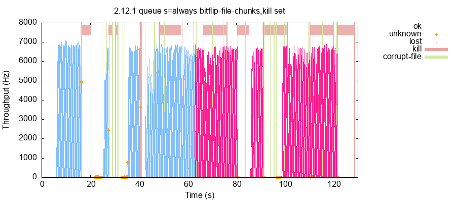
A lot of my work involves staring at visualizations trying to get an intuitive feeling for what a system is doing. I’ve been working on a new visualization for Jepsen, a distributed systems testing library. This is something I’ve had in the back of my head for years but never quite got around to.
A Jepsen test records a history of operations. Those operations often come in a few different flavors. For instance, if we’re testing a queue, we might send messages into the queue, and try to read them back at the end. It would be bad if some messages didn’t come back; that could mean data loss. It would also be bad if messages came out that were never enqueued; that could signify data corruption. A Jepsen checker for a queue might build up some data structures with statistics and examples of these different flavors: which records were lost, unexpected, and so on. Here’s an example from the NATS test I’ve been working on this month:
{:valid?             false,
 :attempt-count      529583,
 :acknowledged-count 529369,
 :read-count         242123,
 :ok-count           242123,
 :recovered-count    3
 :hole-count         159427,
 :lost-count         287249,
 :unexpected-count   0,
 :lost               #{"110-6014" ... "86-8234"},
 :holes              #{"110-4072" ...  "86-8234"},
 :unexpected         #{}}
You can tell just by eyeballing the numbers that most attempted writes were acknowledged, and about half of them were later read back. There were just three “recovered” writes where we didn’t know if they succeeded or not, and they later appeared. About half were lost: acknowledged but never read. About half of those were “holes”—writes which were missing even though some later write was read. And there’s a few examples, in case you want to go digging into the history and see what might have happened to specific writes.
At the same time, there are lots of qualitative questions that are hard to answer statistically. For instance, were the lost writes clustered together in time, or were they spread out? What faults might have happened to trigger write loss? Is data loss universal on short timescales, or do, say, 40% of writes survive? Is the rate of writes uniform over time, or do lost writes happen faster or slower? Did the data loss event destroy all records prior to some time, or did some survive? Could apparent data loss be attributed to slow delivery of messages, or is it likely that the data is truly missing?

This plot helps answer some of those questions. Time flows left to right. Each operation (measured by its invocation time) becomes a single point. Colors indicate the flavor of that operation: OK, lost, unknown, or so on. Operations are splayed out vertically, in such a way that the aggregate “shape” of the plot traces out the rough throughput of the system over time. Operations from the fault-injection system are shown as vertical lines and (for process kills) horizontal bars spanning them.
From this, we can see that data loss occurred in two large chunks, starting near a file-corruption operation at roughly 65 seconds and running until the end of the test. They were not evenly mixed: writes were lost in blocks. A few records survived around 87 seconds in, then everything later was lost as well. These OK records in the middle hint that this is “real” data loss, as opposed to readers lagging behind. The rate of OK and lost operations was essentially constant at ~6,800 records/sec. Unknown operations happened much slower–likely due to timeouts. Some, but not all, process kills caused throughput to tank. You can guess that some of them took down a majority of nodes, halting the cluster until nodes were restarted; others were recoverable after a few seconds.
Jepsen tests can range from a handful of operations to hundreds of millions, and our plots need to work for both extremes. In this case, the plot used single-pixel dots for frequent operations like ok and lost, but for the handful of unknown operations, switched to a larger cross style. These infrequent operations are often of the most interest, and could easily get lost in the noise, so it makes sense to visually emphasize them.
This isn’t a good plot yet. I am, for instance, running out of colors to represent all the kinds of faults, and that leads to awkward color-blind issues like the red/green pairing here. There’s a sort of aliasing/moire pattern caused by the point layout algorithm, which divides the history into 512 time windows, computes a height for each window based on throughput, and then spreads the window’s points along the y axis uniformly. I feel like I may be able to use some sort of adaptively-determined transparency and overlapping dots to get something a little closer to a density field, and that might read more clearly, but I’m wary of what might happen when some windows have lots of plots and others have only a few.
Despite these shortcomings, this plot has been remarkably useful! I’m using them to get an at-a-glance feel for how bad a given test run is, to figure out where in the history I should look, and to refine the checker itself.
Because there’s lots of ways you could interpret these plots—showing lost elements of a set, highlighting transaction anomalies in an SQL test, showing how read-only and read-write queries are affected by faults—I don’t really know what to name them yet. For now I’m calling them “op color plots”. They’re available in the current Jepsen 0.3.10-SNAPSHOT, and I’m hoping they’ll be useful in all kinds of tests to come.
When dealing with high variation in data values, I often reach for log plots, sometimes to the consternation of my coworkers. But those don’t help so much for event data (as opposed to gauge data)…
By the way, the legend is currently missing colors for ok/lost.